Abstract logo concept for a Logistics company

4
Created on 99designs by Vista
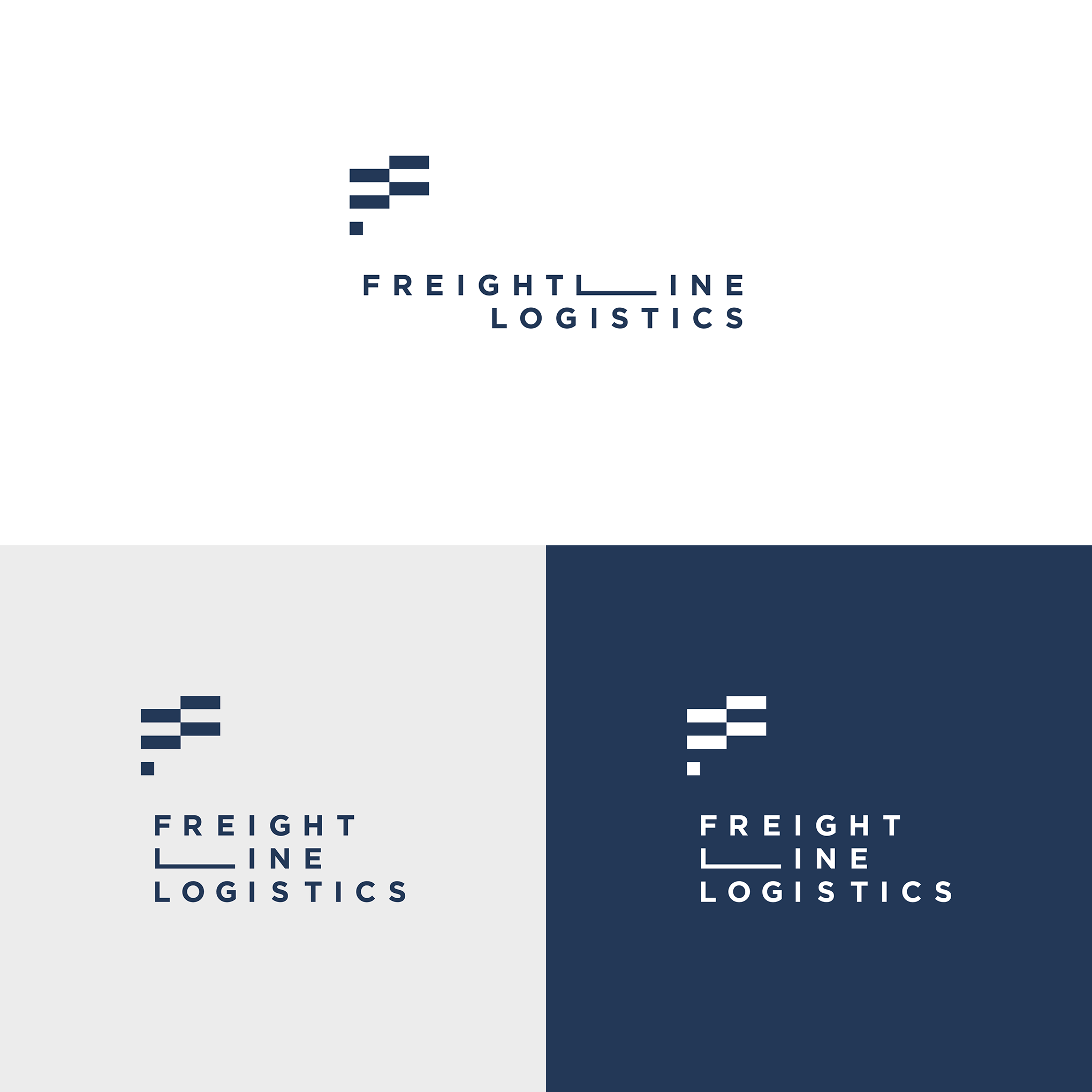
Freight logistics is a company specialized in getting freight moved via road, rail, or sea.
The task was to design a logo that is modern and professional, geometric and masculine. The idea behind this specific logo is the use of abstract, geometrical elements that form letter "F", also it can be seen as two trucks sideview and as a third option as a flag. And in the name itself we have a stylized letter "L" which represents the concept of a line. The logo is pretty modular and all elements can be used separately from each other, horizontally or vertically.