
Created on 99designs by Vista
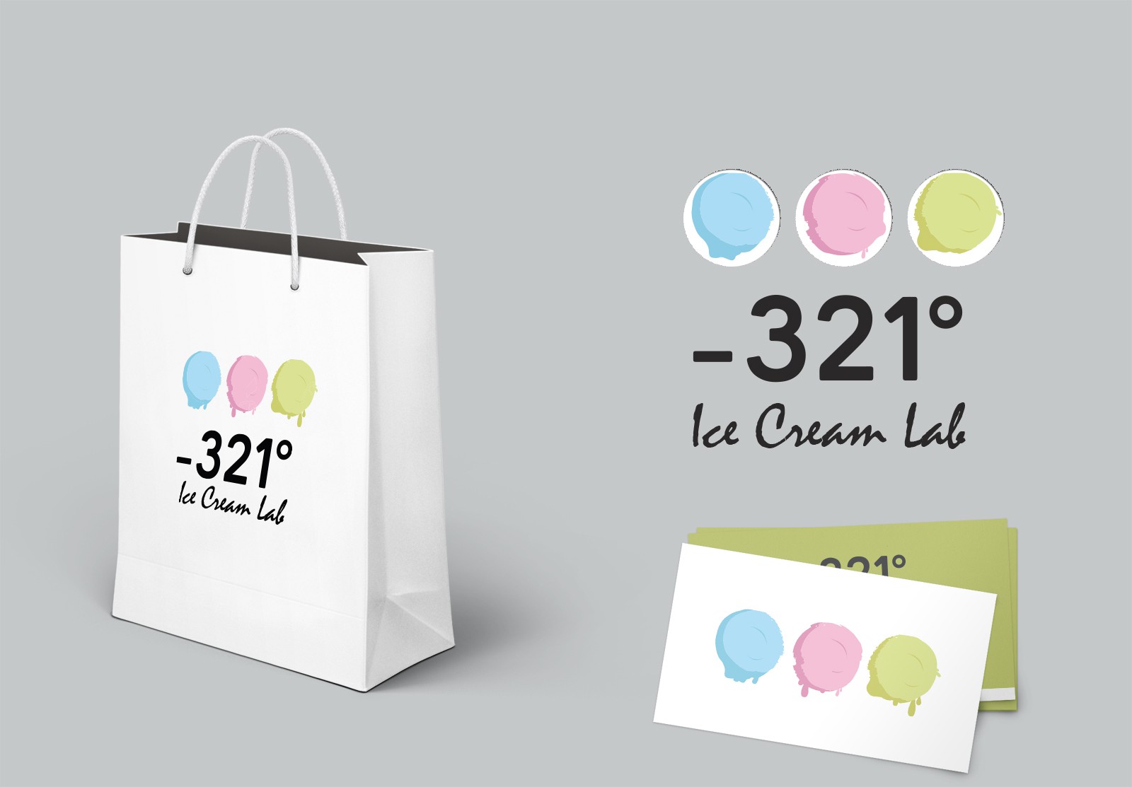
I decided to be minimal and went with soft colors as it was one of the requirement from client side.
Process: As I was designing for ice cream company, I started with different shapes of scoop, cone and different other combination. In middle of my process the idea of showing only scoop struck to my mind and I decided to go with it.