
I want to introduce you one of my Best solutions. I used white background for all states of app and decided to use monochrome in edit mode of a contact. I think user will clear understand what he is doing.
I worked on this quick little interaction over the Buttons and, I was thinking about how most banking sites for mobile apps are often minimalistic one color apps with a clear understanding application or something similar to that idea. Which is certainly not a bad way of doing it, but I wanted to create a different way of viewing this content on a static scrollable screens.
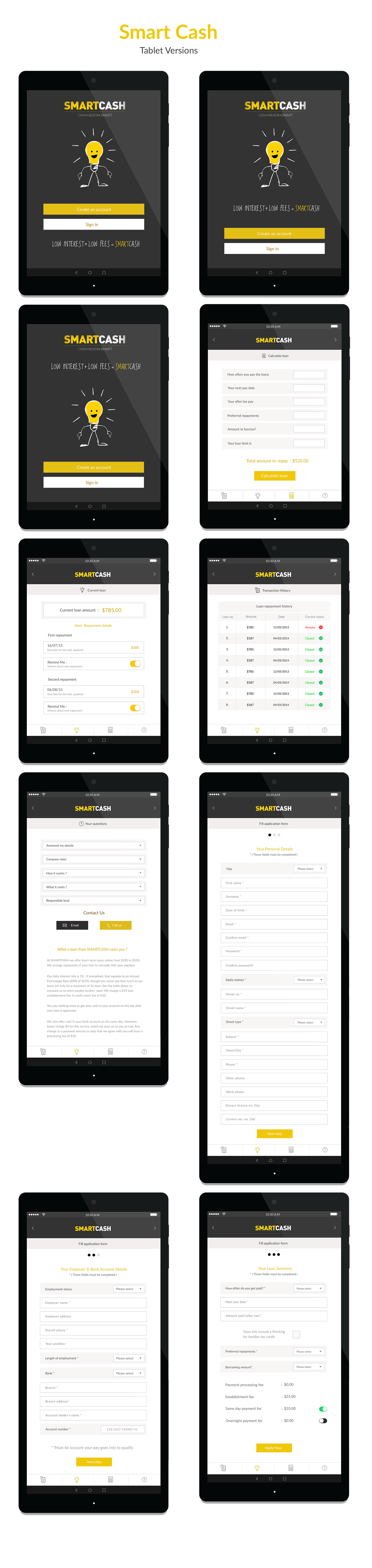
Also as you can see, the amount of content that can be accessed through the 3 different sections on the App and being responsive was an added expense to this app. Ranging from ios, android and tablet along with Nexus 9 design and some type of community or social interaction opportunity.