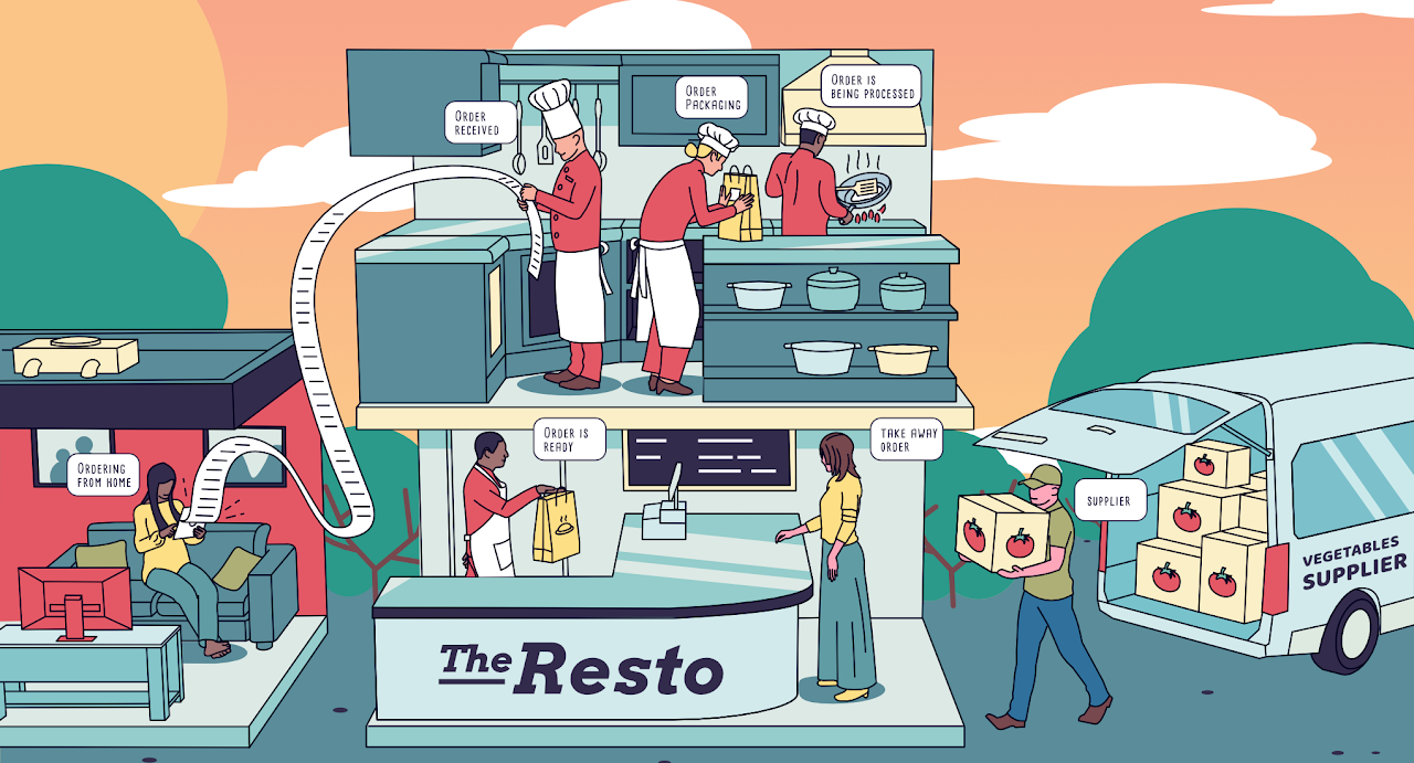

The goal of this illustration is to explain the general flow of a restaurant.
The concept and the style are cartoonish with a little touch of a comic strip.
In this illustration, I highly used outlines to make the cartoonish style dominant. The outlines width are uniform to keep the image looks clean. The colour of the outlines are also uniform to make them standout from the fill colours. But for the background objects, I didn't give them outlines so that they would look less focused.
For the fill colours I chose flat, solid colours with no gradient to maintain the simple cartoonish look. No core shadows on the objects but used simplified drop shadows on some characters.
I maintained the visual balance by positioning the biggest and the densest object, i.e, the restaurant, at the centre of the scene. Meanwhile I drew the rest of the big objects (car & house) relatively at the same height and width to fill the left and the right space with the same portion.