Modern dark geometric logo for NYC cafe & bookstore

0
Created on 99designs by Vista
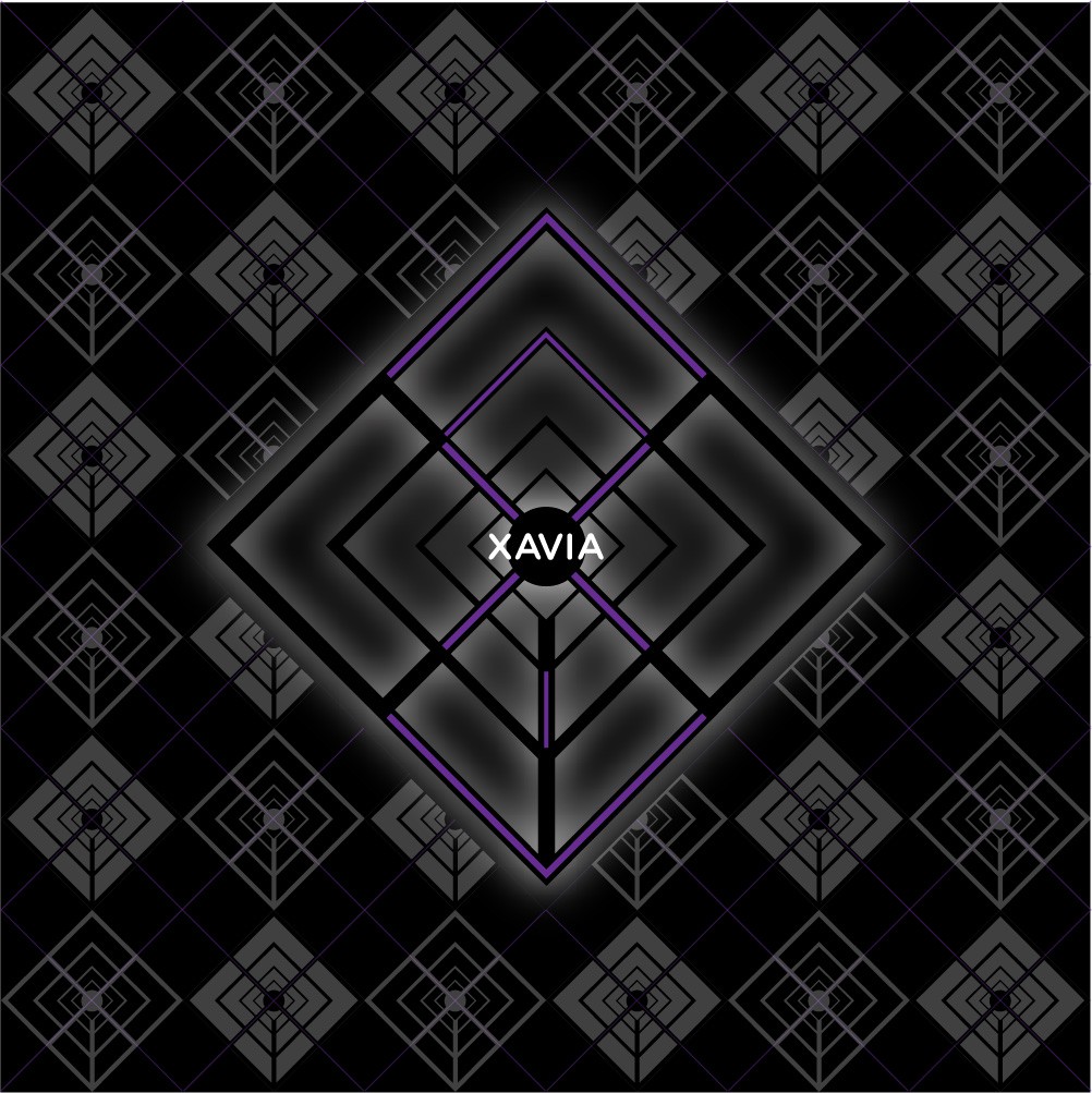
The client wanted a logo that was dark, edgy, geometric and a throw-back to the 60s-70s era of the underground art scene. Through the process I discovered that the letters of XAVIA could be comprised of all straight lines, some at 45 degrees. This led to the image portion of the logo, which I then used as a repeat pattern upon which to overlay the actual logo.