A Flyer Design For A Self Storage Company

0
Created on 99designs by Vista
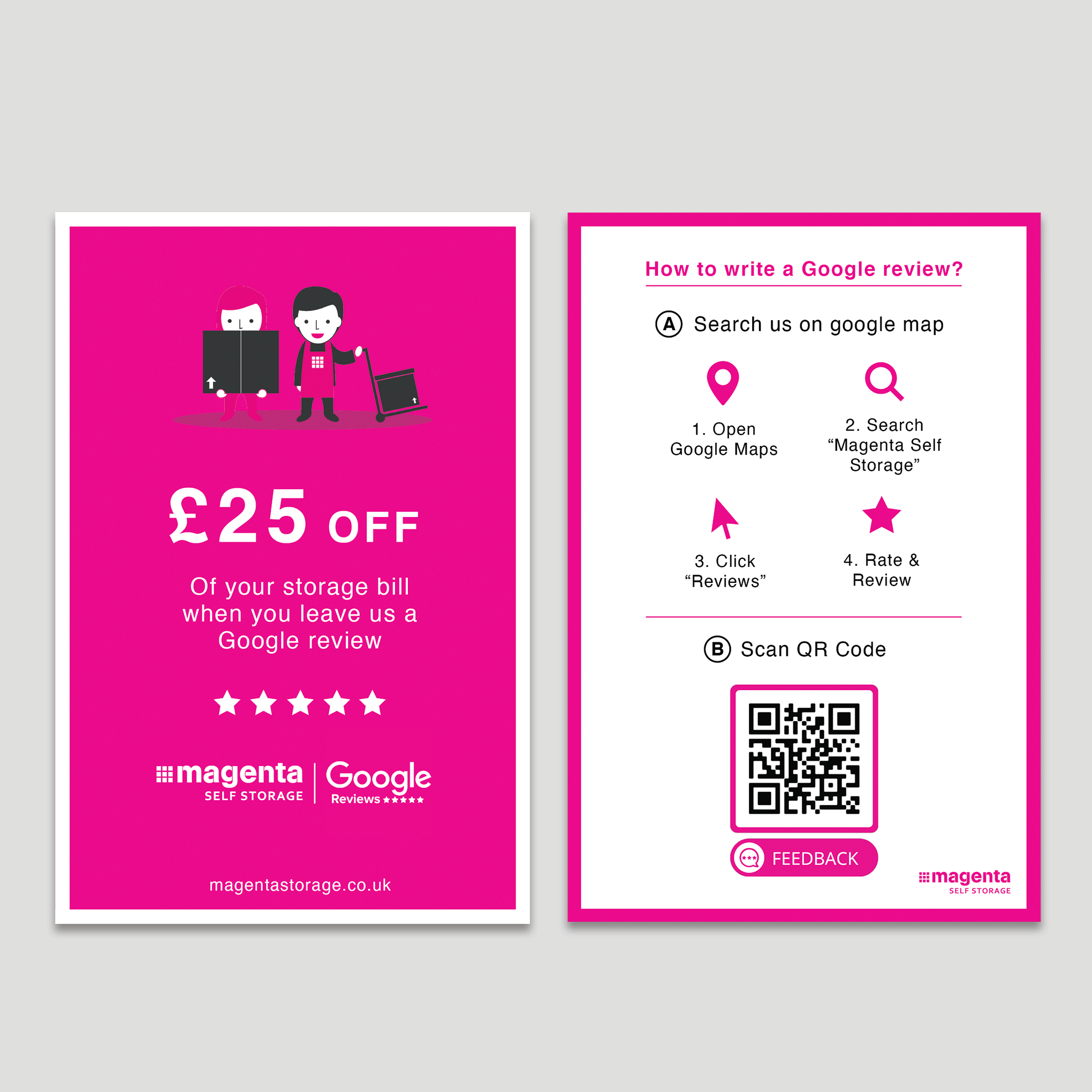
This is the vertical version for the client's comparison. The only differences from the horizontal layout are the amount of graphics and the placement of the company URL. I also added another Magenta logo at the backside to make use of the space. As long as the elements and layout are done properly, either format can create highly engaging content and send out a clear message.