
Created on 99designs by Vista
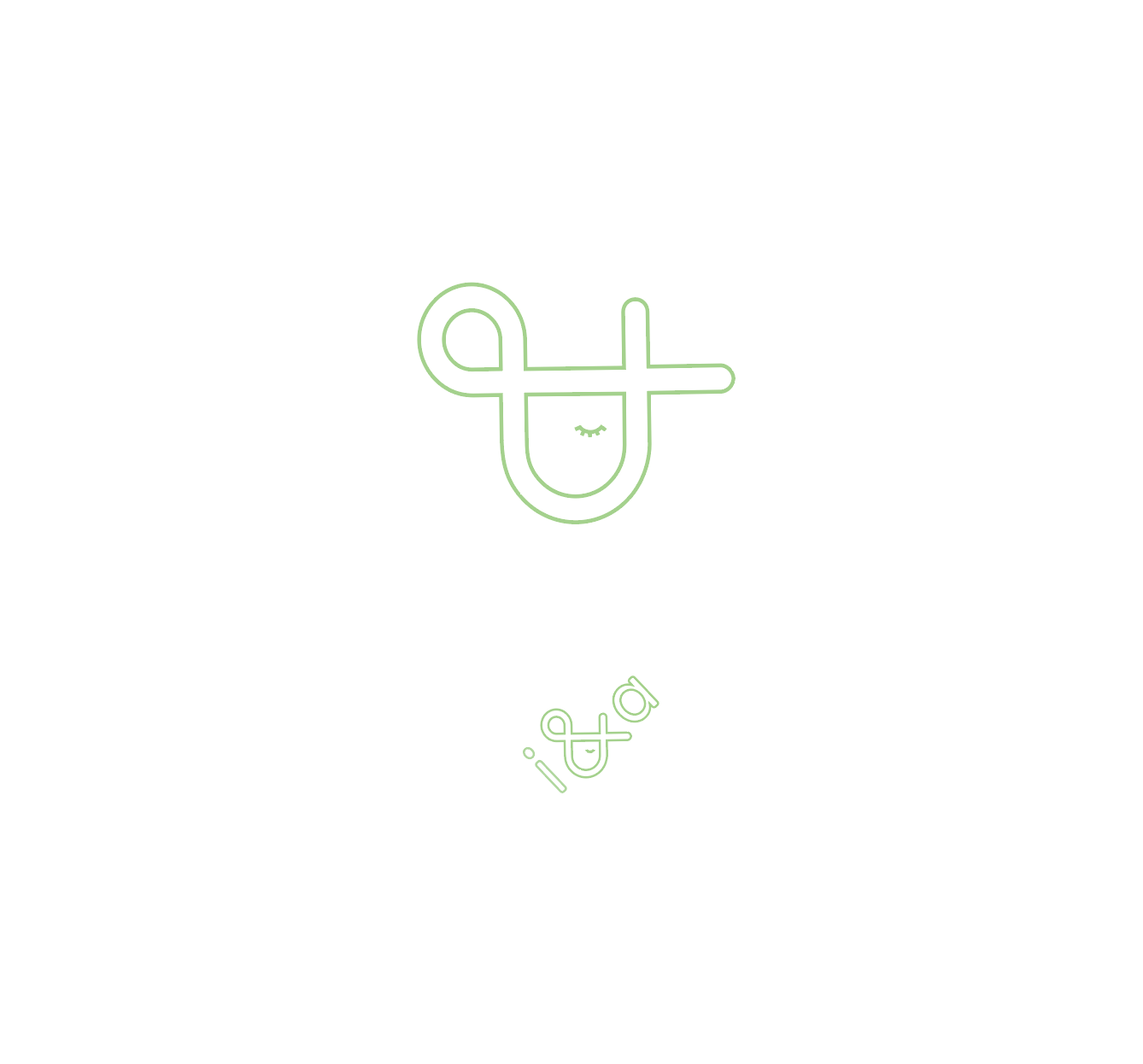
Developed this monogram and logo for a children's clothing line called i and a. Instead of focusing on the letters I focused on the 'and'. Tilting the ampersand forces the viewer to look at the graphic structure of the symbol. For the text I placed the letters around the ampersand at the angle the monogram is tilted at, informing the ampersand of it's role in the logo.