
The logo design process can be hard to define outright: every graphic designer has their own approach to logo development. For some, it’s methodical and disciplined—60 minutes of concept development followed by 90 minutes of execution, all while listening to their favorite album to boost creativity. For others, it’s watching reruns of Will & Grace until they find inspiration from the commercial breaks.
We’re not here to judge—if it’s stupid but it works, then it’s not stupid. But we are here to outline a general logo design process that you can use as a starting point. We’ll show you how to combine research and analysis with creative ingenuity to create an outstanding logo design. Below are the 7 basic steps to logo development, complete with examples that show the process in action.
What are the 7 steps to design a logo?
—
- Step 1: Evaluate the brand
- Step 2: Research the industry
- Step 3. Make a list of where the logo will be used
- Step 4. Sketch a variety of logo concepts
- Step 5. Create digital drafts in vector software
- Step 6. Refine your logo design with feedback
- Step 7. Prepare and deliver the final logo files
Step 1. Evaluate the brand
—
Your first step in the logo design process is to understand what the brand embodies and what the business’s goals are. This is known as the Client Discovery phase. There’s no one-size-fits-all for logo design—a logo is only as good as its representation of a business, so it won’t be effective unless you first know what kind of impression the brand is aiming for.
A lot of the information you’ll need should be in the design brief. But there are always clients who can’t articulate what they want or don’t know themselves, and it is up to the designer to draw this information out. And even in the case of the most detailed, well-composed briefs, designers should probe deeper—explore how the client really feels about their business and the awesome work that they do in words that go beyond the official corporate statement. Every bit of insight you can get into the company and the people that comprise it will contribute to the success of your design in the long run.
Here are just a few general questions you can start with to kick off your client research:
- Why are you getting a logo design? What problem are you trying to solve?
- If your brand were a person, what adjectives would you use to describe it? (clever, prudent, etc.)
- What is your brand voice? (eloquent & formal, jokey with slang, etc.)
- Which beliefs and values are important to your brand?
- What is your unique value proposition? What does your company offer that your competitors don’t?
- How do you want your customers to describe your brand to their friends?
Of course, these aren’t exactly design questions—this belongs more to the field of branding. But considering that logos are one of your strongest vehicles for branding, asking these questions is a necessary first step.
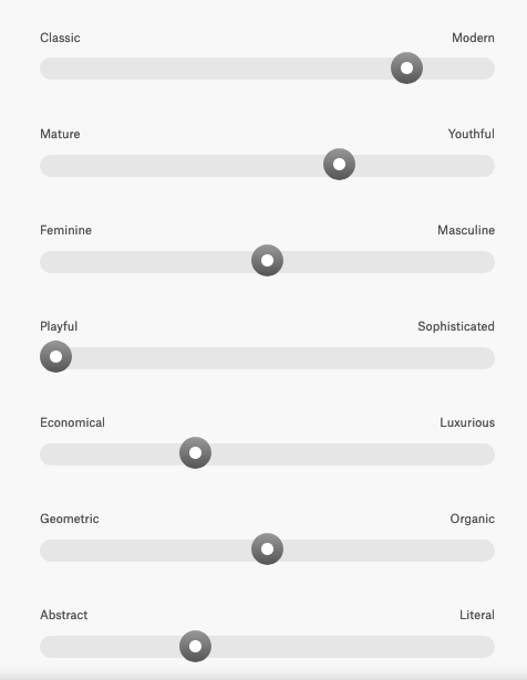
Evaluating a brand is one of the first steps in the 99designs logo design process. We ask clients to define their attributes in some core areas so that designers have a good idea of the brand identity before they even start. Even taking just 5 minutes to consider where a brand falls on these metrics can help you formulate more complex brand inquiries later on.
At the end of this step, you should have your own well-informed take on the brand (supported by plenty of notes). From here, you can start brainstorming to distill this information into key words and phrases. One popular brainstorming technique is mind mapping, in which designers take their overall brand impressions and expand them into related ideas. Save your favorites—these will support your logo concepts later. But your research isn’t done yet!
Step 2. Research the industry
—
No brand exists in a vacuum. Every company has to contend with the standards of their industry, even if they are doing everything to stand out.
So the next step in the logo design process is to research what kind of logos competitors and industry leaders have. This is referred to as the Industry Discovery phase, and it can mean the difference between a logo that is generic and one that is too far out of left field.
From other logos in your industry you can glean:
- what logo techniques work for your industry, i.e., brand colors or particular shapes
- what logo techniques are overused, to the extent that they lose personality
- what logo techniques are ignored, which might inspire ways to stand out
- what kind of customers dominate your industry (or which customers your rivals prefer to target)
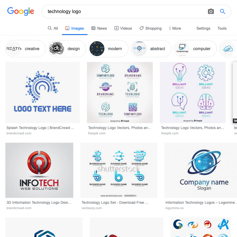
For example, most logos in the tech industry use the color blue. With this information, you can either (1.) also use blue because the data suggests it works best, or (2.) use another color in order to stand out from the sea of blue logos. There’s no right or wrong answer, it depends on how much of a priority standing out is to your branding strategy. But either way, you won’t even know there’s a choice to make unless you research other logos in your industry first.
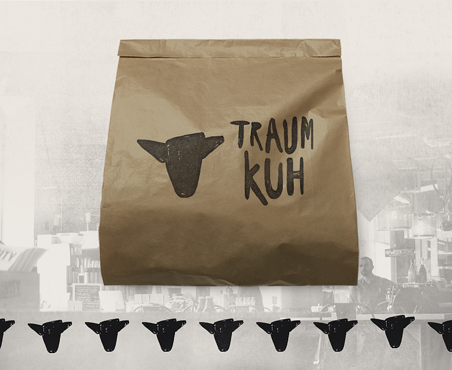
Step 3. Make a list of where the logo will be used
—
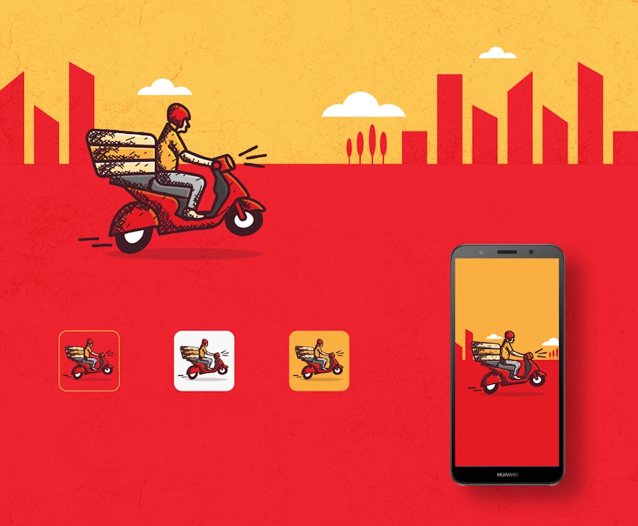
Just like the brand strategy, the physical or digital space the logo will occupy should also inform your design choices. Research where the logo will be used—this is known as the Application Discovery phase. Although you may not yet have a complete list, the earlier you can predict how your logo will be used, the better for logo development. Where you need your logo might determine the color model, the shape or even design software used.
For example, if you want your logo on large billboards, you can design more detailed, larger-scale logos. If it’s going to be situated in the corner of a mobile app, you should opt for simplicity and smaller scales. If social media will play a heavy role, the logo should sit comfortably in both circular and square avatars and be adaptable to larger cover images. If you want to stand out in video or digital platforms, you can even have an eye-catching animated logo. More often than not, a designer will want to plan for all of these scenarios.

These are some common use cases for logo design:
- Website icons
- Signs and banners
- Product packaging
- Advertisements
- Social media profiles and banners
- Business cards
- Company letterheads (invoices, internal documents)
- Email marketing campaigns
- Marketing swag (pens, shirts, mugs, etc.)
You also have to consider the logo’s shape and how it fits its surroundings. Some spots require a wide, rectangular logo, like letterheads; others require something small and discreet, like a watermark on shareable content. Luckily, you can have several different versions in your stable.
Considering the popularity of responsive logos, you don’t have to limit yourself to one standard design. Plus, you always have the best logo for any situation. The trick is to make sure that these different versions of your logo all feel like the same logo. It helps to plan ahead and design these variations all at the same time, rather than designing the main logo and adapting it to different situations as they come up. If an adaptable logo appeals to you, aim for four variations at first, escalating the logo in both size and complexity.
Step 4. Sketch a variety of logo concepts
—
If you already have some logo ideas, you might be tempted to jump ahead into logo design software. But before you start zeroing in on your final design, take some time to sketch plenty of ideas. Sketching is cheap, easy and fast, but most importantly, it’s an effective brainstorming tool.
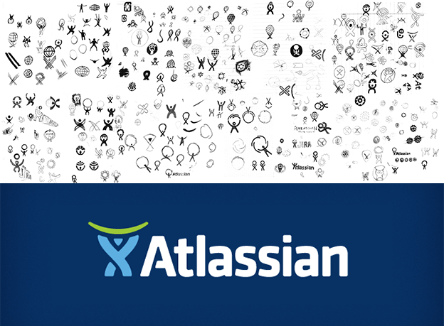
Sketch out a bunch of different logo ideas to see how they look outside your head. For one thing, the act of sketching alone can get the creative juices flowing. But more to the point, sketching a wide variety of concepts lets you see what works and what doesn’t. You’ll start to notice certain threads or themes you like, and you can mix and match different elements until you settle on the perfect one.
Even if you’re almost certain you have an idea you like, sketch other ideas. You might surprise yourself with something you like better, and if nothing else, this will give you some backups in case the client ends up not liking the direction of your initial concept.
Once you’ve settled on your preferred concept, try sketching some variations on it, adding or removing elements, changing minor details, and beginning typography explorations.
Step 5. Create digital drafts in vector software
—
By now, you should have a messy smorgasbord of logo sketches as well as a better sense of what you want the final logo to look like. Of those sketches, take around 3 of your best ones and recreate them in your design software. This is where your final logo really starts taking shape.
For a comprehensive step-by-step guide, take a look at this article on making a logo in Illustrator.
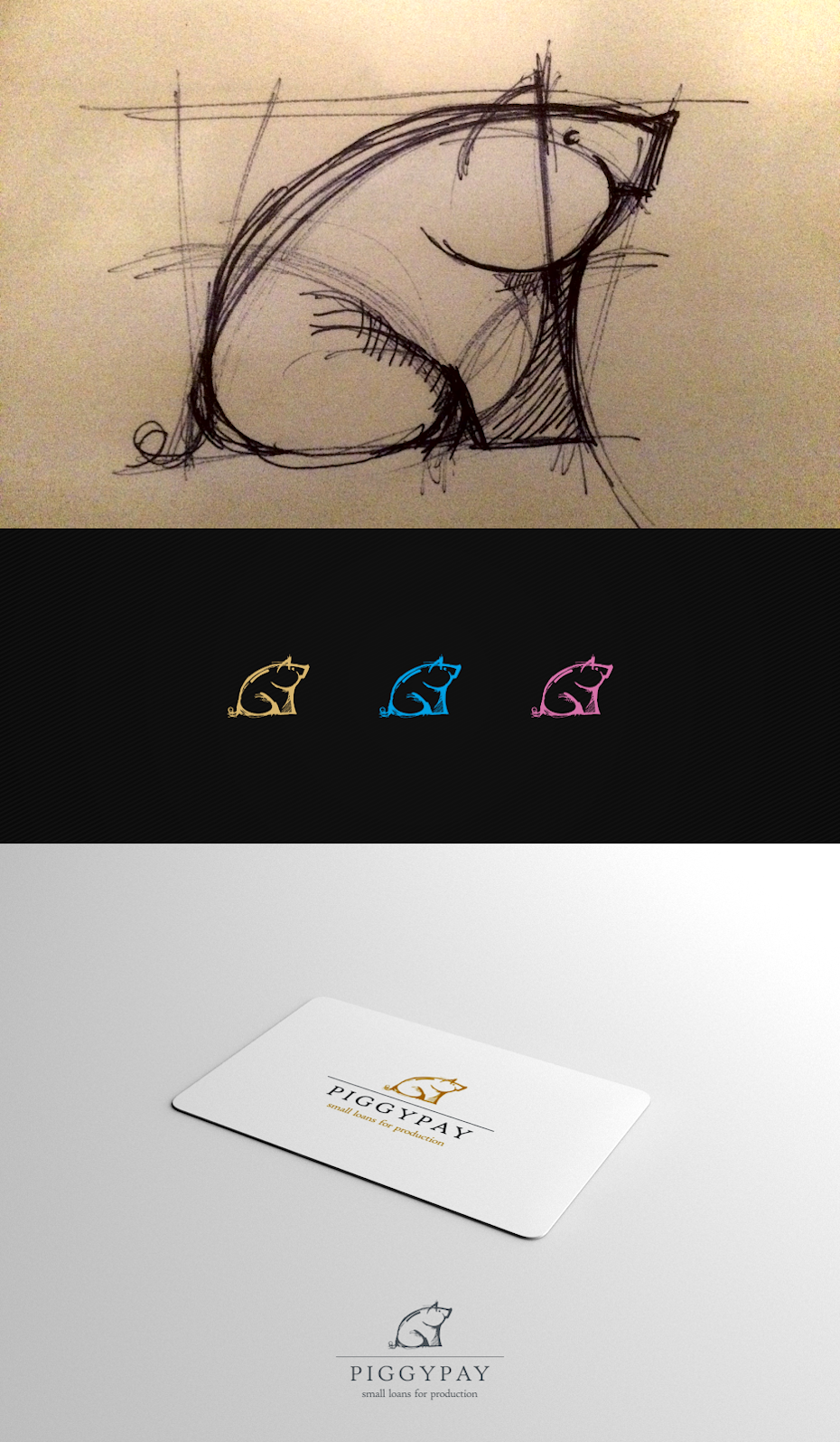
Now you can make all those crucial design decisions you couldn’t in the sketch phase. In your digital draft, you can experiment with logo colors as well as typography.
In case you’re a business owner trying to make your own logo, this step of the logo design process does require technical knowledge of design software. But you can always use a user-friendly DIY editor. Although these don’t have the features or complexity to create a substantial logo, they do have the bare minimum of what you need.
You can also hire a freelancer or commission a design contest if you prefer to outsource this to step to someone with more expertise. Working with a professional will pretty much guarantee a great result. If you want to learn more about the pros and cons, check out this comparison of the best ways to get a logo.
Once you have a solid draft, go the extra mile to create a presentation to showcase your logo. This involves presenting the flat logo along with any variations, an overlay with brand imagery, and mockups of the logo out in the real world. The goal is to communicate your vision of the brand with a persuasive, knockout logo presentation.
Step 6. Refine your logo design with feedback
—
Here’s something you don’t need to be a designer to appreciate: everyone’s a critic! No matter how perfect you think your logo design is, chances are someone, somewhere, is going to request changes.
That’s not always a bad thing. When you work on the same image for hours or days (or weeks, or months), you tend to mistake the forest for the trees. A fresh set of eyes on the final product can reveal some room for improvement you hadn’t noticed before.
You want to encourage criticism on your logo design and show it to a variety of people. Show your clients or co-workers first and foremost, but don’t stop there! Show your significant other, your friends, your neighbors, your Uber driver. New, fresh ideas come from the unlikeliest of sources, and at the very least you can gauge people’s reactions to the logo to make sure it’s having its desired effect.
Getting feedback on your design is the easy part. The real challenge lies in interpreting and acting on client feedback. Ask follow-up questions and use your best judgment to decide what feedback is most valuable. Your logo’s job is to represent a brand, and the question you should ask yourself is whether the feedback is helping the logo do that better. If not, you may need to politely articulate the reasoning behind your design choices. At the same time, you don’t want to be so stubborn or precious over your logo that you are unwilling to see potential flaws.
Step 7. Prepare and deliver the final logo files
—
With your logo finalized, it’s time to deliver your final files! You should determine what design files your client needs at the start of the process (in case they have any special requirements). But in general, it is best to include:
- Layered source vector files, such as AI
- Layered EPS/PDF files (for clients using different vector programs)
- High resolution raster files for web, including PNGs with transparent backgrounds
Be sure to include basic variations of the logo, such as full color, black, white and monochrome.
If you are using a standard font (as opposed to custom lettering), you should also outline the text. Otherwise, the font will change on computers that do not have it installed.
You should also inform the client of any fonts used in the logo in case they will need them for future branding projects (be advised that most font licenses require the client to purchase it themselves).
This is all information that is great to include in a brand style guide. Not only does this ensure that your logo will be used correctly long after you are gone, it makes a great parting gift for the client and increases their confidence in the brand vision you’ve crafted for them.
Smart logo development brings brands to life
—
You could say that great design takes talent, but you can never know for sure what that means or whether you have it. What you can say for sure is that great logos do not happen by accident. They are the result of critical thinking, interrogating, collaborating, exploring, failing and starting again.
Each detail of your logo—colors, fonts, sizes, shapes and more—can affect the kind of impression it makes on customers. Although at the end of the day your logo may not resonate with every single viewer, a robust logo design process is your best opportunity to bring your brand vision to life.
Want to learn more about logo design? Check out our article on how to design a logo.
—
This article was originally written by Peter Vukovic and published in 2012. The current version has been updated with new information and examples.
